-
作品名稱秋水体 / AUTUMN WATER
-
作者李佳靈
-
得獎年份107年
-
指導教授李根在
-
比賽名稱ADOBE DESIGN ACHIEVEMENT AWARDS
-
主辦單位Adobe Systems Incorporated
-
獎項名稱Semifinalist
-
作品連結
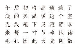
秋水體 Khiu Shui (The Floods of Autumn)
This is my first try on font design. The initial idea was to create a kind of specially-shaped logotype. But as the design process went on, I became more and more interested in font design. After a few attempts and revising, this particular font came into being, which I named “Qiushui”,meaning the floods of Autumn. It reminds us the lines of “Khiu Shui”in Chuang Tzu, “The time of the autumnal floods was come, and the hundred streams were all discharging themselves into the Ho. Its current was greatly swollen, so that across its channel from bank to bank one could not distinguish an ox from a horse.” But to be honest, “Qiushui” literally means “In Autumn (Qiu) I started it and my capability (shuiping) is average”. The design derives from Qing Dynasty’s woodblock prints and incorporates the characteristics of SimSun and KaiTi. The strokes have simple and clear finish and the font looks delicate and stylish in whole. This font design is ideal for in text words, and also nice for logos. It entered the “Font Star” competition.
个人尝试制作的第一款字体,最初的想法是做一款造型特别的标准字类字形,可是越做越激发起做内文字的兴趣,于是经过几次修改后变成现在以内文字形为方向的字体。我把这款字体取名叫做秋水体,秋水之意。让人最先想起《庄子》中的《秋水篇》“秋水时至,百川灌河,泾流之大,两涘渚崖之间,不辩牛马字”。但是其实只是“秋天开始制作,水平比较一般”之意。字体的风格参考了清代刻本的字形,结合了宋体与楷体的风格特点。笔画收笔简洁有力,整体风格清秀俊朗。适合用作内文字体的同时,亦可以做标题字使用。
汉仪字体之星参赛作品。