-
作品名稱鹹甜字體大對決!
-
作者簡予恬、蔡昀芸、邱彩瑛
-
得獎年份113年
-
指導教授賴忠平
-
比賽名稱NY TDC 紐約字體設計競賽 Young ones
-
主辦單位紐約字體藝術指導俱樂部 The Type Directors Club, New York, USA
-
獎項名稱Winner
-
作品連結
設計概述 Design Brief
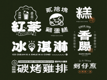
臺灣的美食琳瑯滿目,卻沒有一款字體勾勒出這些絕妙滋味。本作品中共呈現了兩款分別代表鹹味與甜味的字體,各有粗、中、細三種字重,可適用於招牌及菜單等各種場合需求。
我們想利用視覺與味覺融合臺灣道地小食的美味口感與鹹甜韻味,讓小吃店的招牌與菜單不再冰冷,而是充滿字體的香氣與情懷。
With all the delicious cuisines in Taiwan, obviously there should be a font which can better represent these wonderful tastes. We have designed two fonts representing salty and sweet flavors respectively, each with three different weights, i.e., W3: Light, W6: Semi Bold and W9: Ultra Bold, which can be used for various applications such as signage and menus.
We attempted to design typefaces that can visually display the common tastes of sweet and salty.
作品說明 Description
臺灣小吃中有許多以鹹、甜為主題的代表性美食,像是鹹酥雞和珍珠奶茶,所以我們選擇以鹹甜口味為主題發想字體,不僅能體現食物的美味,更充分反映臺灣獨特的美食文化魅力。
在使用層面,鹹味與甜味更容易被不同年齡層和口味偏好的消費者接受,使字體使用範圍增廣,得以運用在多數與美食相關的場合。在作品呈現方面,這兩個充滿對比性的詞語同時出現時能產生帶有對立感的平衡,除了能凸顯視覺化後鹹與甜之間的差異,更能使整個作品具備相抗衡的穩定性,給人耳目一新的感覺。
The design concept of our fonts is inspired by the salty and sweet flavors of all the street food in Taiwan. As Taiwan is an island and used to be a major producer of sugarcane, we can use salt and sugar freely in our food. Being the iconic snack and drink of street food, the salt and pepper chicken and pearl milk tea represent the contrast of tastes and also the balance of harmony when having them at the same time, and with our fonts, we hope to visually represent the contrast and balance of the taste, and also reflecting the food culture of Taiwan more distinctively.